Ethiopian Embassy.org

_______________________
UX Design - UI Design - Usability Testing
_______________________
Ethiopianembassy.org is the official embassy website of Ethiopia for the Washington DC headquarter. It provides international services from anywhere in the world.
Scope
Problem framing
Update visual design
Validation
Duration
2020-2021
Role and Responsibilities
UX | UI Designer
User Research
Interaction Design
Visual Design
Information Architecture
Wire Framing
Prototyping
Testing
OVERVIEW
The Embassy of the Federal Democratic Republic of Ethiopia in Washington DC is the main diplomatic mission of the Federal Democratic Republic of Ethiopia in the United States of America. As mentioned above, The Site provides many services including visa services, Laissez passer, passport service and many more.
As someone that was born and raised in Ethiopia but residing in United States, I can say I use the site regularly. Every time i use it, i notice the site is not user friendly at all. I always have a hard time browsing around and finding the information i need so i decided to fix.
Here the screenshot of the home page.

THE PROBLEM
There were known issues with interaction and visual design. The first thing I noticed was the site looked outdated and doesn't fit the purpose.
Although it has high traffic, the focus that was given to better the user experience was the bare minimum.
I also did a comparison with different embassy websites and I saw the site lacks the standard visual design.


EMPATHIZE
To get a clear picture of the current situation, I used a variety of methods for gathering different types of data.
Surveys
With the goal of understanding how the users feel about the site, which features they thought were most important, and the issues they were facing, I surveyed 30 users of varying age group and technological background. I wanted to understand how the users’ answers would vary depending on this factors and then interviewed two users from each group.
As a result, the feedbacks i got were very similar.
USER RESEARCH
What did people say?

I regularly use the site to check recent notices and i cant know what the notices are about till i read them half way through. The way the notices are posted looks like a middle school's notice board. NEEDS WORK!!
I usually use this site to renew my passport and check notices and the interface just throws me off. It really doesn't look like a legit embassy site.
The first time i was on the website i thought it was a fake site. It doesn’t look well organized and legit to be an embassy website.
As a graphic designer, I didn’t find the colors used on the website attractive. They don’t look well integrated.
They’re notices were put in an image form which I found very inconvenient to share.
The main menu and the page number keeps disappearing when the image changes and it makes it hard for me to keep up and also there is no way of accessing the rest of the notices while being on one.
USABILITY TESTING
In addition to the surveys, I wanted to know the usability of the site in depth so I went ahead and did a usability test. I used a standard usability test containing 10 questions in which users get to give a score of 1 to 5 in which 1 corresponding to strongly disagreeing and 5 corresponds to strongly agreeing.
After Looking at a user’s answers and the corresponding number score for each response, I calculated the overall SUS score by using the following framework:
Add up the total score for all odd-numbered questions, then subtract 5 from the total to get (X).
Add up the total score for all even-numbered questions, then subtract that total from 25 to get (Y).
Add up the total score of the new values (X+Y) and multiply by 2.5.
(11+8) x 2.5 = 47.5


DEFINE
PERSONAS
I synthesized our research to create two user personas. This helped us develop empathy for our target user group and to help drive design decisions going forward.
.png)
PROBLEM STATEMENT
Zoey needs a way to access the notices easily, because she wants to keep updating her self before she travels back home.
HOW MIGHT WE...
How might we help Zoey access the notices with ease so she can get an update on what is going on?
.png)
PROBLEM STATEMENT
David needs an organized site because he wants to find the information and service he needs with ease.
HOW MIGHT WE...
How might we help David access the site in an organized manner, So he doesn't get intimidated while using it?

IDEATE
SITE MAP
I then designed a general site map to organize the content of the site and understand the most efficient way to navigate through the experience in as few clicks as possible.


RESPONSIVE DESIGN
My next task was to create responsive designs for desktop and mobile. Using the feedback from my survey and usability testing, I worked to enhance the UI and add images and text to mirror what the live website would look like. I conducted more usability tests with the same users after creating my high-fidelity wireframes and received positive responses. They reported that the changes and improvements that were made, improved the overall experience. Check out my high-fidelity mockups below.
KEY HI-FIDELITY MOCKUPS


Home

Covid-19 Response Page


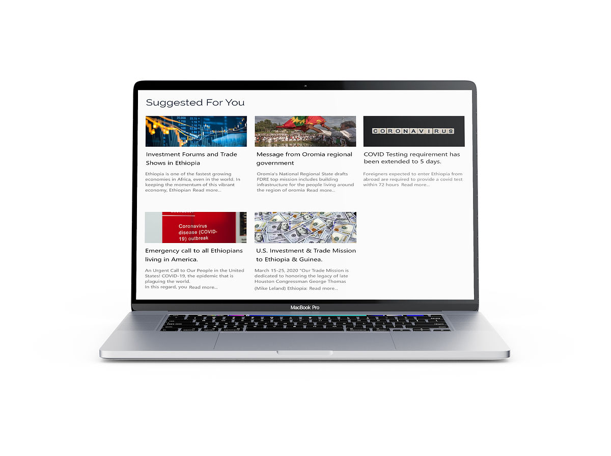
To highlight here, I selected a few notices from the big notice section.

From users feedback, I noticed that most users want easy access to the rest of the notices while being on one. Hence that, I added an option at the bottom for all notices.
Notices
I also ensured that the notices are readable and accessible to anyone that does not speak Amharic.

TEST
USABILITY TESTING AND FEEDBACKS
I conducted another usability tests with my hi-fidelity prototypes and learned several things that informed my final iteration. I wanted to test the site's functionality and get feedback about the navigation, interface design, and overall user experience.

USABILITY TESTING
I went on and measured the usability after the redesign and I got this result.

------------------------------------------------------------------------------------------------------------------------------
REFLECTIONS
UX projects will usually never go as planned - but that is okay
Depending on the problem you are trying to solve, the scope of the project can change anytime during the project. We should always remember that there are more factors involved other than the user’s needs.
Collaboration
I learned that working solo can limit ones ability and being able to work with other people from different teams can bring in new perspectives and ideas. Not only can it improve your work but gives people a sense of motivation and drive when working towards the same goal. Collaborating with different teams is something I am looking forward to.
Properly articulating design decisions
One of the most important roles as a designer is how you communicate with other people, whether that is with users, team members or stakeholders. The better you can articulate your design decisions to others, the better the design will come out.